
Create a Custom Draggable Alert with HTML, CSS, and JavaScript
In modern web applications, custom alerts enhance user experience by replacing the default browser alert() popups, which can be intrusive and visually unappealing.
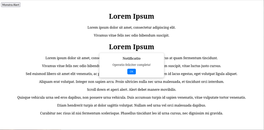
In this guide, we’ll build a clean, draggable, and customizable alert that stays visible even when scrolling.
📌 Features of This Custom Alert
✅ Minimalist and modern design
✅ Draggable with the mouse
✅ Only closes with a button
✅ Stays visible even when scrolling
✅ HTML text is centered without modifying CSS
1️⃣ Setting Up the HTML Structure
Create an index.php file with a button to trigger the alert and some sample Latin text.
<!DOCTYPE html>
<html lang="en">
<head>
    <meta charset="UTF-8">
    <meta name="viewport" content="width=device-width, initial-scale=1.0">
    <title>Minimal Draggable Alert</title>
    <link rel="stylesheet" href="styles.css">
</head>
<body>

    <button onclick="showAlert('Notificatio', 'Operatio feliciter completa!')">Show Alert</button>

    <h1 style="text-align: center;">Lorem Ipsum</h1>
    <p style="text-align: center;">Lorem ipsum dolor sit amet, consectetur adipiscing elit.</p>

    <div class="content">
        <h1 style="text-align: center;">Lorem Ipsum</h1>
        <p style="text-align: center;">Sed euismod libero sit amet elit venenatis, ac pharetra arcu porttitor.</p>
        <p style="text-align: center;">Aliquam erat volutpat. Integer non sapien arcu. Proin ultricies nulla nec urna malesuada.</p>
    </div>

    <!-- Alert -->
    <div class="custom-alert" id="customAlert">
        <div class="custom-alert-title" id="alertTitle">Titulus</div>
        <div id="alertMessage">Nuntium</div>
        <button onclick="closeAlert()">OK</button>
    </div>

    <script src="script.js"></script>

</body>
</html>
📌 What this does:
- Adds a button to trigger the alert.
- Includes centered Latin text using
text-align: center;directly in the HTML. - Defines the alert container, which remains hidden until activated.
2️⃣ Styling the Alert with CSS
Create a styles.css file to define the alert’s appearance.
/* Alert container */
.custom-alert {
  position: fixed;
  top: 50%;
  left: 50%;
  background: #fff;
  color: #333;
  padding: 15px;
  border-radius: 8px;
  box-shadow: 0 4px 10px rgba(0, 0, 0, 0.2);
  font-size: 14px;
  min-width: 280px;
  max-width: 350px;
  display: none;
  cursor: grab;
  user-select: none;
  text-align: center;
  border: 1px solid #ddd;
}

/* Alert title */
.custom-alert-title {
  font-weight: bold;
  font-size: 16px;
  margin-bottom: 10px;
}

/* Close button */
.custom-alert button {
  background: #007bff;
  color: white;
  border: none;
  padding: 6px 12px;
  margin-top: 10px;
  border-radius: 5px;
  cursor: pointer;
  font-size: 12px;
}

.custom-alert button:hover {
  background: #0056b3;
}

/* Show alert */
.custom-alert.show {
  display: block;
}
📌 What this does:
- Hides the alert initially (
display: none;). - Makes it draggable with
cursor: grab;. - Applies a modern box-shadow effect for a sleek look.
- Styles the close button for a better user experience.
3️⃣ Making the Alert Work with JavaScript
Create a script.js file to handle opening, closing, and dragging the alert.
function showAlert(title, message) {
  let alertBox = document.getElementById("customAlert");
  document.getElementById("alertTitle").textContent = title;
  document.getElementById("alertMessage").textContent = message;
  alertBox.classList.add("show");

  // Correct initial positioning
  alertBox.style.left = `${(window.innerWidth - alertBox.offsetWidth) / 2}px`;
  alertBox.style.top = `${(window.innerHeight - alertBox.offsetHeight) / 2}px`;
}

function closeAlert() {
  document.getElementById("customAlert").classList.remove("show");
}

// Draggable alert
let alertBox = document.getElementById("customAlert");
let isDragging = false;
let offsetX, offsetY;

alertBox.addEventListener("mousedown", (e) => {
  isDragging = true;
  offsetX = e.clientX - alertBox.getBoundingClientRect().left;
  offsetY = e.clientY - alertBox.getBoundingClientRect().top;
  alertBox.style.cursor = "grabbing";

  document.addEventListener("mousemove", onMouseMove);
  document.addEventListener("mouseup", onMouseUp);

  e.preventDefault();
});

function onMouseMove(e) {
  if (!isDragging) return;

  let newX = e.clientX - offsetX;
  let newY = e.clientY - offsetY;
  let maxX = window.innerWidth - alertBox.offsetWidth;
  let maxY = window.innerHeight - alertBox.offsetHeight;

  // Keep the alert inside the viewport
  newX = Math.max(0, Math.min(newX, maxX));
  newY = Math.max(0, Math.min(newY, maxY));

  alertBox.style.left = `${newX}px`;
  alertBox.style.top = `${newY}px`;
}

function onMouseUp() {
  isDragging = false;
  alertBox.style.cursor = "grab";
  document.removeEventListener("mousemove", onMouseMove);
  document.removeEventListener("mouseup", onMouseUp);
}
📌 What this does:
- Displays the alert and centers it on screen.
- Enables dragging when the user clicks on it.
- Ensures the alert remains within screen boundaries.
🎯 Final Thoughts
We’ve created a modern, draggable, and customizable alert that integrates smoothly into web applications.
Advantages of this approach:
✔ Custom design and modern look
✔ Doesn’t block JavaScript execution
✔ Remains visible even when scrolling
✔ Easy to modify and extend
 Alessio Puppi's Alchemy