
How to Convert an HTML Table to a Flexbox Layout
Tables are a classic way to present structured data in HTML. However, they can sometimes lack the flexibility needed for modern web design. Flexbox, a powerful CSS layout model, provides a more dynamic and responsive way to structure data. In this guide, we’ll explore how to convert a traditional HTML table into a Flexbox layout, complete with practical examples and step-by-step explanations.
Why Use Flexbox for Tabular Data?
- Flexibility: Flexbox allows for better control of element positioning, alignment, and distribution.
- Responsive Design: It’s easier to make layouts responsive with Flexbox compared to traditional tables.
- Styling Freedom: Flexbox provides more styling options, enabling modern, clean designs.
Step-by-Step Conversion Process
1. Understand the Original Table Structure
Before converting, let’s look at a simple HTML table:
<table>
    <thead>
        <tr>
            <th>ID</th>
            <th>Name</th>
            <th>Position</th>
            <th>Department</th>
            <th>Status</th>
        </tr>
    </thead>
    <tbody>
        <tr>
            <td>101</td>
            <td>John Smith</td>
            <td>Project Manager</td>
            <td>Operations</td>
            <td>Active</td>
        </tr>
        <!-- Additional rows -->
    </tbody>
</table>
This table organizes data into rows (<tr>) and cells (<td> or <th>). While functional, it’s rigid and can be challenging to style for modern designs.
2. Redefine the Structure Using Flexbox
To convert this table to a Flexbox layout, we’ll:
- Replace the
<table>,<thead>,<tbody>, and<tr>elements with<div>containers. - Use Flexbox properties to align and distribute the content.
Here’s the equivalent structure in Flexbox:
<div class="table-container">
    <div class="table-header">
        <div class="table-cell">ID</div>
        <div class="table-cell">Name</div>
        <div class="table-cell">Position</div>
        <div class="table-cell">Department</div>
        <div class="table-cell">Status</div>
    </div>
    <div class="table-row">
        <div class="table-cell">101</div>
        <div class="table-cell">John Smith</div>
        <div class="table-cell">Project Manager</div>
        <div class="table-cell">Operations</div>
        <div class="table-cell">Active</div>
    </div>
    <!-- Additional rows -->
</div>
3. Style with CSS
The next step is to style the structure with Flexbox properties. Below is the CSS to achieve a professional, modern layout:
body {
    font-family: 'Roboto', Arial, sans-serif;
    margin: 0;
    padding: 0;
    background-color: #f0f2f5;
    color: #333;
}

.table-container {
    display: flex;
    flex-direction: column;
    width: 90%;
    margin: 40px auto;
    box-shadow: 0 4px 12px rgba(0, 0, 0, 0.1);
    background-color: #fff;
    border-radius: 8px;
    overflow: hidden;
}

.table-header, .table-row {
    display: flex;
    justify-content: space-between;
    padding: 12px 20px;
    border-bottom: 1px solid #ddd;
}

.table-header {
    background-color: #4CAF50;
    color: #fff;
    font-weight: 600;
    text-transform: uppercase;
}

.table-row:nth-child(even) {
    background-color: #f9f9f9;
}

.table-row:hover {
    background-color: #e8f5e9;
}

.table-cell {
    flex: 1;
    text-align: left;
}

.table-cell.status {
    flex: 1;
    text-align: center;
}
4. Add Visual Enhancements
To make the design more appealing, you can add:
- Hover Effects: Highlight rows on hover to improve usability.
- Badges for status indicators:
<span class="status-badge active">Active</span>
<span class="status-badge inactive">Inactive</span>
<span class="status-badge pending">Pending</span>
And style them:
.status-badge {
    display: inline-block;
    padding: 5px 10px;
    border-radius: 12px;
    font-size: 0.9em;
    font-weight: bold;
}

.status-badge.active {
    background-color: #c8e6c9;
    color: #388e3c;
}

.status-badge.inactive {
    background-color: #ffcdd2;
    color: #d32f2f;
}

.status-badge.pending {
    background-color: #ffe0b2;
    color: #f57c00;
}
Advantages of Flexbox over Tables
- Responsive Behavior: Flexbox adapts to varying screen sizes more gracefully.
- Enhanced Styling: Flexbox makes it easier to implement modern design features such as badges, hover effects, and custom layouts.
- Alignment Control: Flexbox’s alignment properties (“justify-content”, “align-items”) provide superior control over content positioning.
Final Example
Here’s the complete implementation:
<div class="table-container">
    <div class="table-header">
        <div class="table-cell">ID</div>
        <div class="table-cell">Name</div>
        <div class="table-cell">Position</div>
        <div class="table-cell">Department</div>
        <div class="table-cell">Status</div>
    </div>
    <div class="table-row">
        <div class="table-cell">101</div>
        <div class="table-cell">John Smith</div>
        <div class="table-cell">Project Manager</div>
        <div class="table-cell">Operations</div>
        <div class="table-cell status"><span class="status-badge active">Active</span></div>
    </div>
    <!-- Additional rows -->
</div>
Conclusion
Flexbox offers significant advantages over traditional HTML tables for structuring and styling data. By following the steps outlined in this guide, you can transform rigid tables into flexible, modern designs that are easy to maintain and scale for various screen sizes.
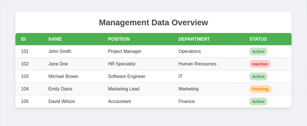
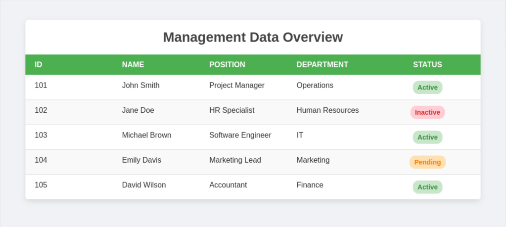
Example
with table
with flex-box
 Alessio Puppi's Alchemy